
Your art department has been working hard shaping out that new logo, and now they’re presenting you with several color options. You step back and consider your choices. Like any executive, you know that even the smallest decisions can affect your profitability. But is there a method to determining if one pigment may more positively impact your bottom line than another? And to that end, what about the colors of the CTA buttons on your email blasts and landing pages? How critical is it that they are the perfect shade? One may surmise that if it’s important to get the colors right in these areas, it then stands to reason that this theme of color influence must also apply to all aspects of your design.
Countless opinions on color palette preference are floating around the internet, and while this post is yet another among them, the intent is to help reinforce, with supplemental research, the important role color can play in your marketing.
To put it plainly, using color strategically may help you make more money.
Sorry. There’s No One-Color Fix-All for Your Problems.
Pump the brakes. If you’re reading this in the hopes that I’ll reveal the secret, revenue-increasing Pantone color, then you’re setting yourself up for disappointment. There are however, ways to integrate color that, when combined with the right audience, industry, messaging, and contrast, can benefit your marketing efforts. It’s just going to take some work. More work than some wanted to put in just a few years back.
For a time, a nasty trend was infecting the e-commerce community with misinformation. It proposed that all marketers need to do is employ a Big Orange Button (BOB) to their emails, landing pages, checkouts, and pretty much anywhere else they wanted a user to take action. Like citrus to the scurvy that is poor click-through rates, the bright, enticing nature of the BOB was purportedly the only cure every marketer needed.

As alluring a proposition as the BOB was, this literal “easy button” was just too good to be true.
Unfortunately for the lazy and lethargic among us, to really boost conversions with your design, more effort needs to be put into audience research. The good news is that many researchers and A/B testers have since put in such leg work to at least get you started.
Know Your Audience
It goes without saying that color preference is highly subjective and varies from person to person. However, this isn’t to say that from these varying opinions, scientific inferences can’t be made. One thoroughly conducted color study by Joe Hallock collected data from 232 people in 22 different countries. Men and women across different age groups were surveyed as a representative sample of individuals’ favorite color under varying circumstances. This study determined that many factors like age, gender, memory association, and emotion can each play a role in color preference.
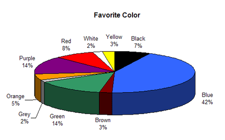
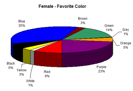
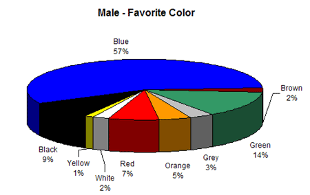
Above is an aggregate of the color preference of all people surveyed. Based on just this instance of color preference, would it be safe to assume that the majority of people prefer the color blue over all other colors? Would this mean that adding a blue CTA or theme to your site, landing page, or email would cause it to perform better than one draped in yellow or orange? If only it were that simple. Below, the preferences are broken down by gender and age group.

So how can this data help you with color selection?
Depending on the customer you’re trying to reach, and the message you’re trying to convey, different colors may perform better in different circumstances. First, you’ll need to get in touch with your customer base.
Know How They Feel…
Astute marketers often divide their audiences into affinity groups – schoolteachers, environmental activists, hunters, soccer moms, etc. These clusters of shopper types each expect their own distinct messaging when they shop. For instance, you wouldn’t send the same email to animal rights advocates that you would send to those whose hobby is taxidermy. This same type of laser targeting can be applied to the color palette used in your marketing.
Suppose you’re trying to promote a business event or fundraiser around Earth Day. When presented with the exact same copy and offer, environmentalists may respond more positively to marketing draped in earth tones rather than those saturated in bright, neon hues. This is because neutral earth tones tend to be associated with a more organic, natural, and peaceful feeling which correlates with the audience you are trying to reach.
And How You Want Your Brand to Be Perceived

Captivating as the chart may be, consumer responses are not as simple to predict as assigning colors to emotions. As Discovery points out, color associations are more closely tied to personal experience and as such, are difficult to apply to a broad feeling. Karen Schloss, a graduate student in psychology at UC Berkeley reported that she “might like purple more than you because [her] sister’s bedroom was purple and [she] had positive experiences there.” Like many things in life, your color preferences are an aggregate of your life experiences.
Context is critical, too. Your site can bombard users with the color yellow, but this does not necessarily mean that it will automatically translate to sunshine and happiness. It all depends on the context. For example, that same joyful and exuberant yellow on one site could translate to “caution!” or radioactivity on another. Just keep in mind the personality you want your messaging to present and build your color palette around that.
Choose the Appropriate Color for Your Industry
Although it may be difficult to directly correlate one-to-one with an emotion, there are some instances where, due to the feeling you want to embody, certain colors are just unable to properly represent your brand. Think of Harley Davidson. What emotions come to mind when you picture their motorcycles and the culture they’ve created? Tough. Rugged. Strong. Cool. Rebellious. Now imagine these sentiments trying to present themselves in pastel pink. It just doesn’t work. You have to make sure the color fits the product. That’s why Harley Davidson uses dark colors like black and steel grey and accents it with a dark orange.
Create Contrast to Guide User Action
Let’s throw it back to the BOB mentioned above. Now I wasn’t trying to say this strategy should be avoided at all costs, because within the correct circumstances, the Big Orange Button may convert better than other colors. But you have to tread carefully with this supposition. It is by no means the be-all and end-all solution. If nothing else, please take away from this post that no one color is better than another for conversions. The reason the BOB would work well when compared against other colors is completely relative to its surroundings. In other words, does it stand out?
Let’s take a look at an A/B test done by RIPT Apparel:
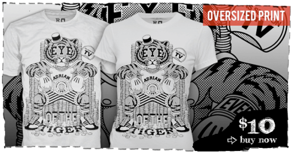
Original Design
In the original design, the black and white “$10 buy now” option not only blended in with its background, but it also wasn’t designed to provoke a click.
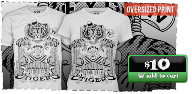
Reworked Design
In the rework, however, RIPT added some button depth to the CTA making it a button and colored it green to instantly draw the user’s eye.
The Result? A 6.3% increase in conversions.
Does this mean green should be your go-to color for CTAs? Of course not! The contrasting color used against a grayscale background in this one example made the CTA pop. Maybe other landing pages or emails have an overwhelmingly green color scheme. In these instances, perhaps an orange or red CTA would be more appropriate. It all depends on what color would grab the user’s attention and guide them to take action.
Conclusion
You will have to test your audience. Tailor your message to the group of shoppers for whom your product or service is best suited. I wish I could offer an easy answer, but if you want those conversions, you are going to have to put in a little work. Hopefully this post can serve as a guide to get you started on the right track. Test out a few things; see what works best for your audience. Then test again. Whether you’re moving the needle in the positive or negative direction, you will be learning valuable information about your audience.